01
The problem
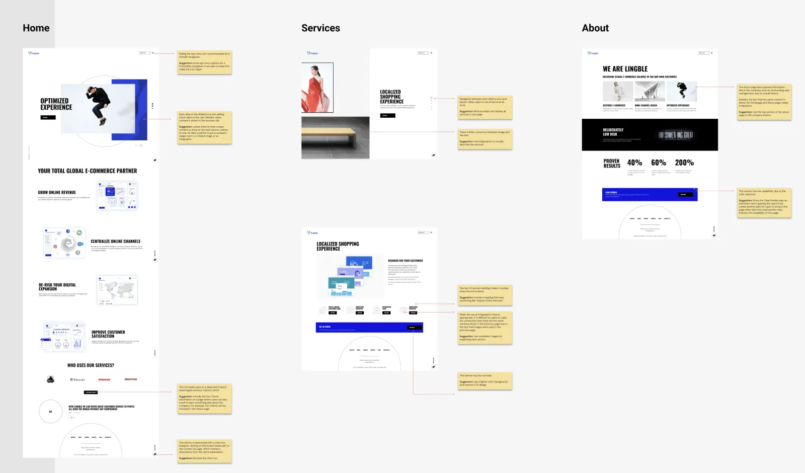
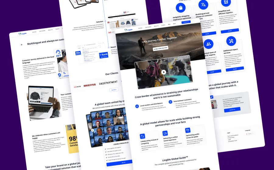
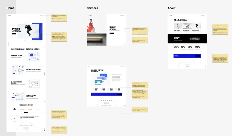
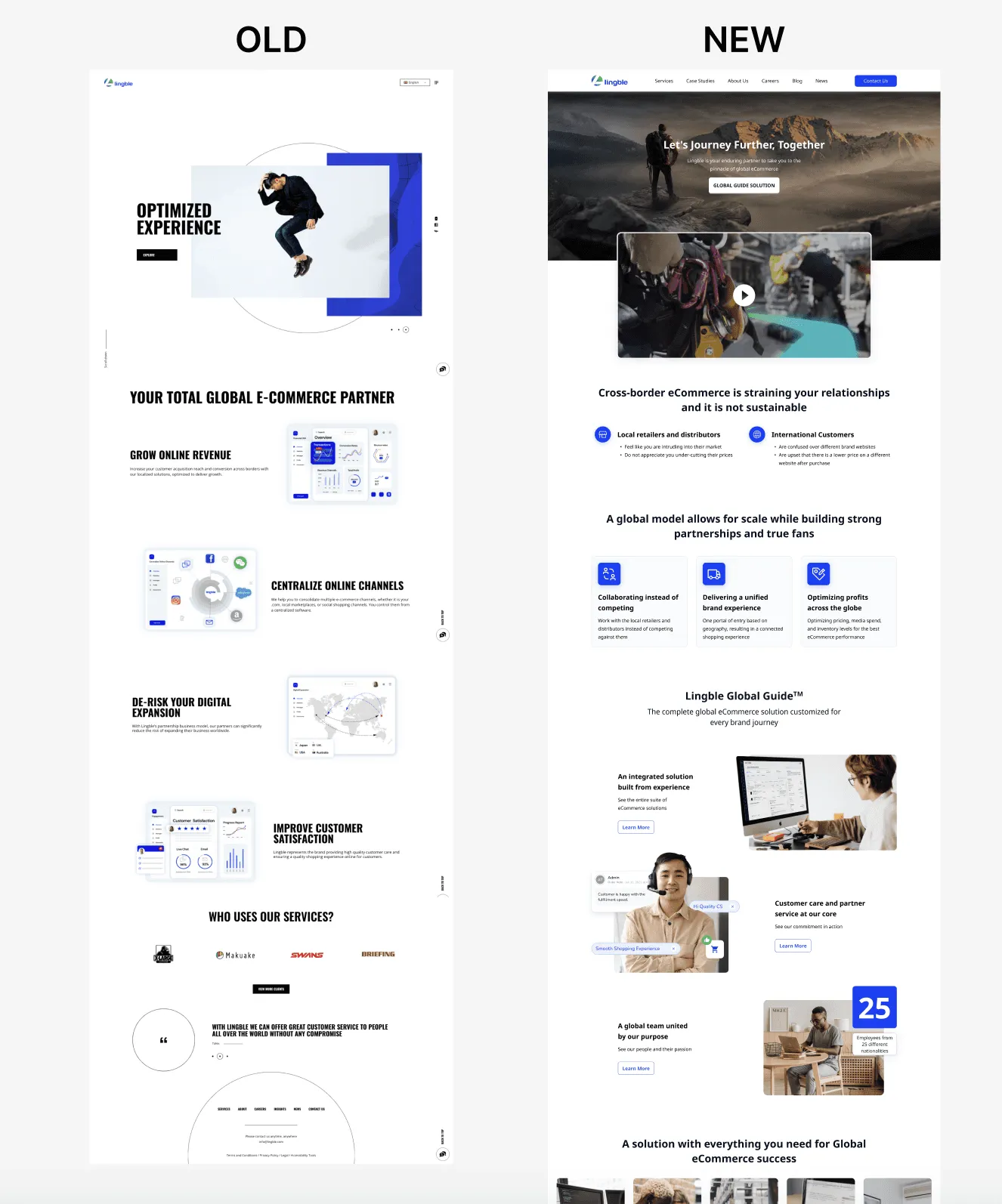
The problem is our old corporate feels like a personal website, lack of information hierarchy, miss alignment of our brand identity, and inconsistency element usage across products
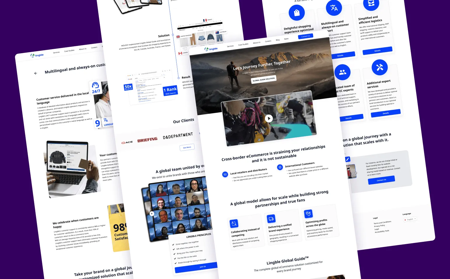
Apply LL3.0 UI to the design
Clean up elements
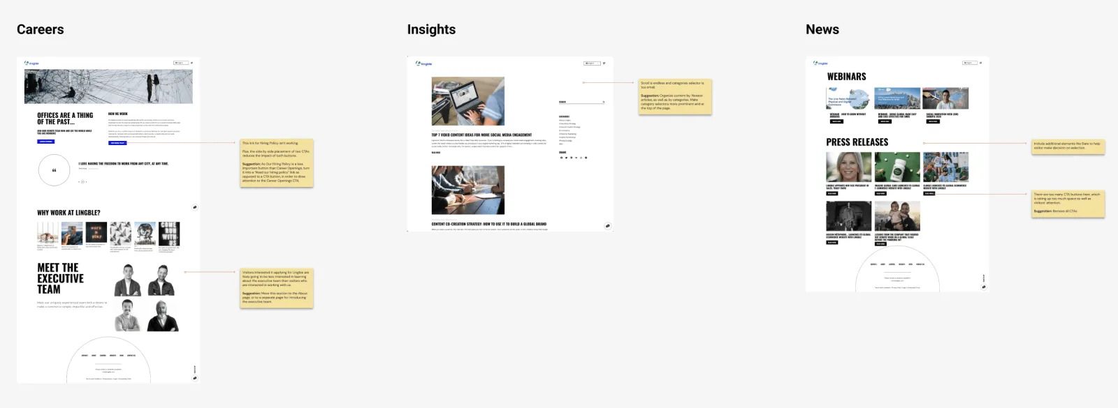
Decide on page structure for the News page so that Press Releases, Webinars, and Company Updates can be organized in one place.
When you have a myriads of business requirements, constraints and politics, a systematic approach is paramount. Design thinking with a proper kick-off allowed us to define a business vision. This was followed by discovery and delivery phases. This article highlights key learnings.
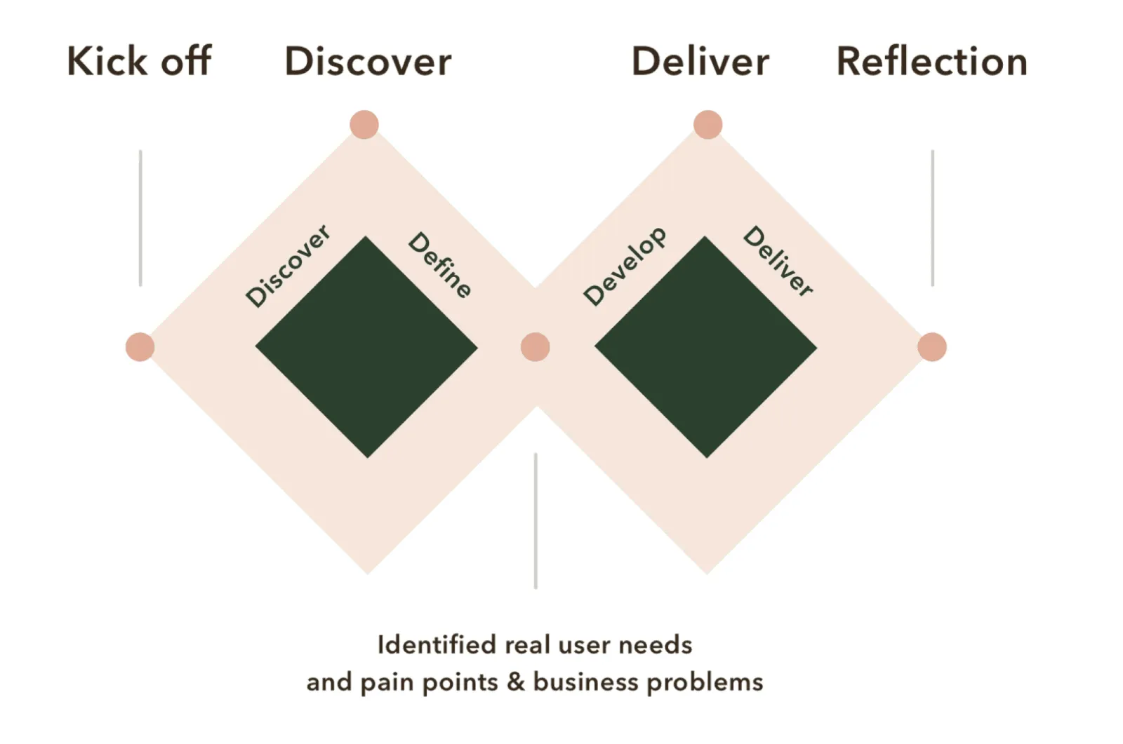
Business requirement:
we started our project by investigating internal (company) and external (users) drivers to crystallise the area of a potential solution, outlining how the website should work, but not how it should look. The process was divided into five steps
First things first, it took us a few workshops with key stakeholders (the business) to understand brand vision, overall goals and challenges. We needed their perspective on:
Documenting insights is important as this becomes a single source of truth which will inform the decision-making process and foster team alignment.
Site and Content Audit:
To provide users with an enjoyable experience on the website it's important to anticipate their needs to provide relevant information on each step. Therefore, different user types and their journeys informed the site structure. Based on this, it was possible to simplity user-flows between pages by removing unnecessary pages, merging existing and adding new when needed.
Modular system
Following initial discussions about building a flexible modular system to represent various content, for our wireframes we created various elements based on the same logic and style with different hierarchy, balancing between images, headlines, and various supporting copy. Ultimately, we managed to create the whole website by using the elements presented below +
Site and Content:
To provide users with an enjoyable experience on the website it's important to anticipate their needs to provide relevant information on each step. Therefore, different user types and their journeys informed the site structure. Based on this, it was possible to simplity user-flows between pages by removing unnecessary pages, merging existing and adding new when needed.
Wireframing
Finally, once all of the planning and foundation was built, we were ready to play with wireframes for the core desktop experience. Once you know WHY and WHAT we are doing in the written form constructing pages is a piece of cake. Of course, we went through circles of feedback, but it was pretty easy to move things around without involving design ego for graphics.
The main point: each page needs to convey the goal and present main user questions and concerns. This information needs to be structured logically to allow users to scan the page quickly.
Content always comes first, once you know what the page needs to achieve you can then focus on elements and graphical composition.
Hi fidality wireframing
Following initial discussions about building a flexible modular system to represent various content, for our wireframes we created various elements based on the same logic and style with different hierarchy, balancing between images, headlines, and various supporting copy. Ultimately, we managed to create the whole website by using the elements presented below
Hi fidality wireframing
Following initial discussions about building a flexible modular system to represent various content, for our wireframes we created various elements based on the same logic and style with different hierarchy, balancing between images, headlines, and various supporting copy. Ultimately, we managed to create the whole website by using the elements presented below
I’m always excited to collaborate on innovative and exciting projects.