Akil Mutawakkil.
CurrentlyAI Product Designer & Manager @ ChatDaddy
Based inBondowoso, Indonesia
ChatDaddy
Case study · ChatDaddy · 2026

Every release, where users already are

We ship every week, but a changelog only helps the people who go looking for it. I designed four places where ChatDaddy users can see what is new, all fed from one release entry.

4places to see a release
1source of truth for every entry
79updates logged in 2026
Weeklyrelease email cadence
01

The problem

Shipping is only half a release. Users have to notice it.

ChatDaddy ships fixes and features every week. The work was real, but most of it went unseen: a customer who never opened a release page never learned that the thing they had complained about was fixed.

01

Users live in the Inbox

Most of the day is spent replying to chats, not browsing menus. News had to reach them there.
02

One message, many readers

Owners, agents and admins need the same news, but each one checks a different place.
03

Easy to fall out of sync

Writing the same release four times by hand means four chances for the copy to drift apart.
04

Seeing it vs trying it

Reading about a feature isn’t enough. Each update needed a direct way to open it.

The idea: write each release once, then show it in four places a user already visits.
02

Inbox conversation

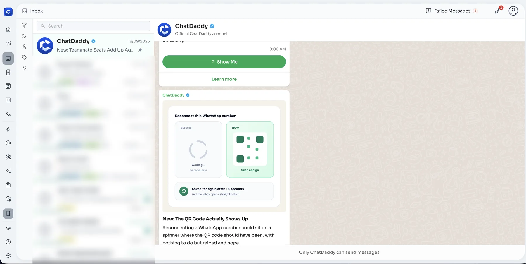
The first place is the Inbox itself. A verified ChatDaddy chat sits pinned at the top of the chat list, just like WhatsApp’s official account. Each release arrives as a message with a picture, a short explanation and a Show Me button that opens the feature.

It is read-only (“Only ChatDaddy can send messages”), so it can never be mistaken for a customer conversation, and the unread badge works the same way as any other chat.

Release updates delivered as a pinned, verified chat in the Inbox
03

In-app notification

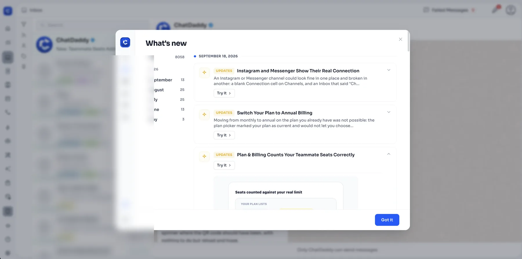
The bell opens a What’s new panel. Updates are grouped by month with a count for each, so returning users can catch up on just what they missed. Every entry can be expanded to show the before/after visual, and Try it takes the user straight to that screen.

What’s new panel: month timeline, expandable entries and a Try it link
04

Update log website

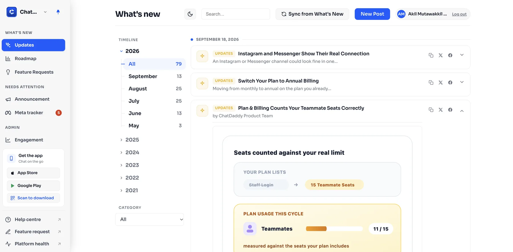
For people outside the app (prospects, partners and our own team), every release is also published on a public update log at api.chatdaddy.tech/updates-dashboard. It has the same entries and visuals, plus a timeline going back to 2021, a category filter, search and one-click sharing.

It is also the editor. Posts are written here once and synced into the in-app panel, so the copy cannot drift.

The public update log: the timeline by year and month, and the post editor
05

Release email

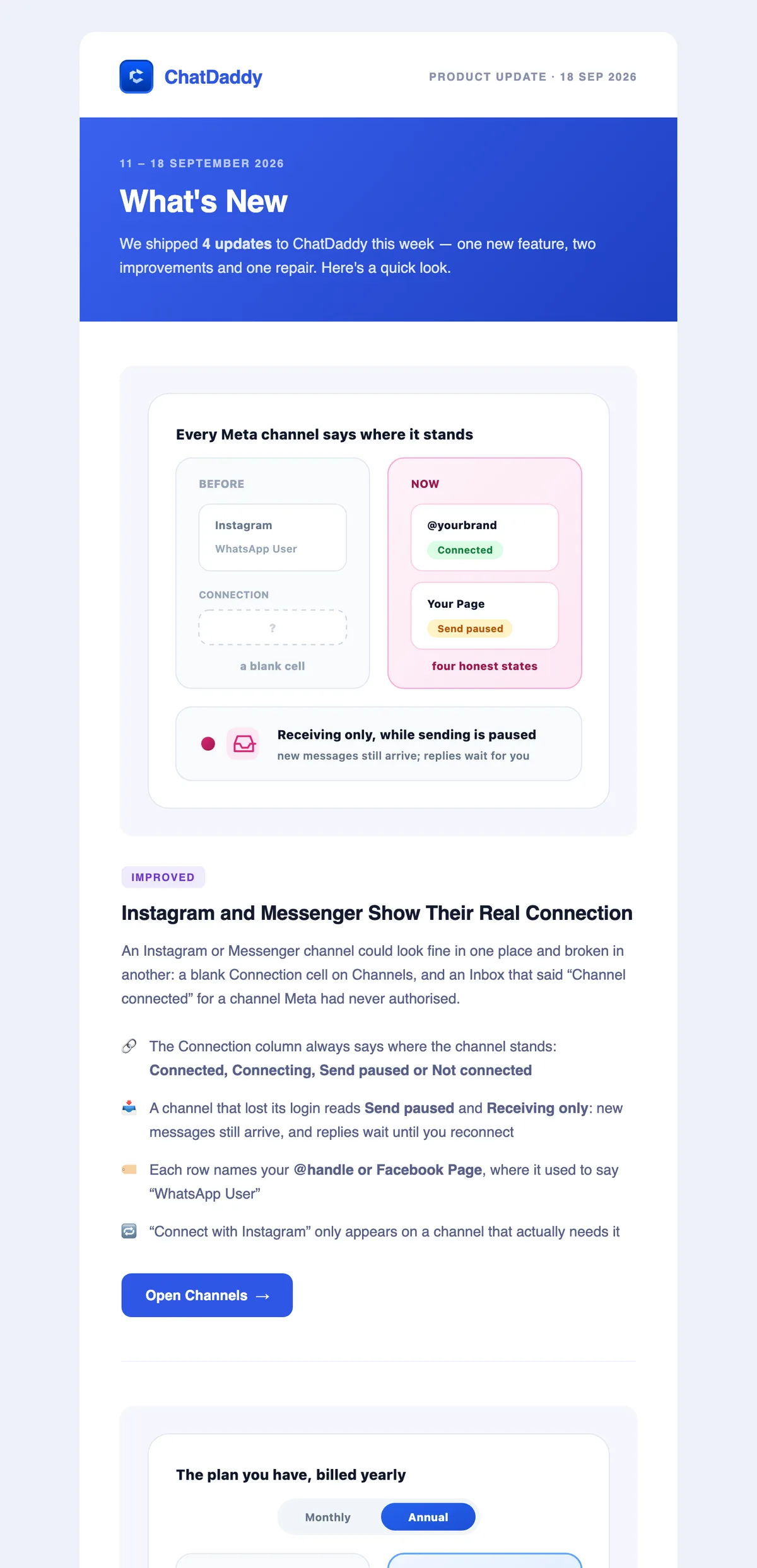
Once a week the same entries go out as an email. Each update gets a label (New, Improved or Fixed), a before/after illustration, a short “what changed” list and one button that deep-links into the app.

Weekly release email (11–18 Sep 2026): opening and first update

See the full email

06

The result

01

Write once

One entry feeds the chat, the panel, the website and the email.
02

Reach people where they are

Agents see it in the Inbox, admins via the bell, and prospects on the web.
03

Straight to the feature

Show Me, Try it and the email buttons open the exact screen.
04

A visible track record

A public, searchable history of every release since 2021.
Got questions?

Let's build products
that actually think.

I’m always excited to collaborate on innovative and exciting projects.

Phone+62 852 2845 4057